
Last modified: 2023-06-03 by  zachary harden
Keywords: expo 86 | vancouver |
Links: FOTW homepage |
search |
disclaimer and copyright |
write us |
mirrors
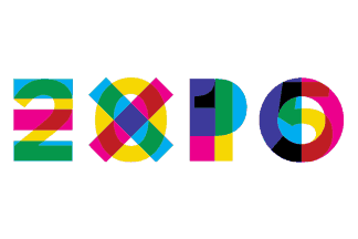
image by Zoltan Horvath, 07 January 2016
See also:
Expo 2015 was a Universal Exposition hosted by Milan, Italy. The opening took
place on May 1, 2015 at 10:00 CEST, and the Expo closed on October 31, 2015. The
BIE General Assembly in Paris decided in favour of the Milanese candidature on
March 31, 2008. Expo 2015 was held under the theme Feeding the Planet, Energy
for Life. The theme chosen for the 2015 Milan Universal Exposition was Feeding
the Planet, Energy for Life. It embraced technology, innovation, culture,
traditions and creativity and how they relate to food and diet. Expo 2015
further developed themes introduced in earlier Expos (e.g., water at Expo 2008
in Zaragoza) in the light of new global scenarios and emerging issues, with a
principal focus on the right to healthy, secure and sufficient food for all the
world’s inhabitants. The concept plan for the Expo 2015 site was presented on
September 8, 2009. It was designed by a committee of four architects: Stefano
Boeri, Richard Burdett, Mark Rylander and Jacques Herzog. Participants to the
Expo include 145 countries, three international organizations, several civil
society organizations, several corporations and non-governmental organizations (NGOs).
An innovation in this Expo was the use of theme clusters, in which several
countries participated in an exhibition of a given product."
Sources:
http://www.expo2015.org/en/rivivi-expo/ and
https://en.wikipedia.org/wiki/Expo_2015
For additional information go to:
Expo 2015 (official website, although
some other countries such as Belarus, Belgium, or Germany, have created
additional external websites)
For other sources go to:
http://www.bie-paris.org/site/en/expos/past-expos/expo-milano-2015
http://www.expocantiere.expo2015.org/en (dead link, accessible through here:
https://web.archive.org/web/*/http://www.expocantiere.expo2015.org/en)
http://www.expomuseum.com/2015/
http://www.milanworldsfair.com/
Esteban Rivera, 21 January 2016
There are several versions of the Expo 2015 flag (depending on the logo
applied to the flag):
1. First version: horizontal white flag with plain
logo which features the letters E X P O in capitals in blue and magenta and
behind each letter, the respective numbers 2 0 1 5 in yellow) on a white
horizontal background, as seen
here.
Source:
http://es.dreamstime.com/fotograf%C3%ADa-editorial-bandera-de-la-expo-image56707392
Esteban Rivera, 21 January 2016
The two texts are written in the same spot, with red and green showing in the
places where yellow mixes with magenta and blue.
What I don't understand is that there are also places in the logo where the blue
and magenta mix to show purple - in the places where the blue ought to leave a
whole in the P and the O, but doesn't - and that purple then mixes with the
yellow creating three black spots. All colours by approximation, though I expect
the organisation to have a style manual somewhere that specifies them exactly.
We all agree that that's a fake, don't we? The flag might still have existed at
some early date and a photograph may have been made, but this one is not it.
Peter Hans van den Muijzenberg, 21 January 2016
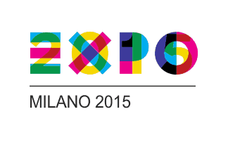
image by Zoltan Horvath, 07 January 2016
2. Second version: horizontal white flag with plain logo and below the
inscription MILANO 2015 in black capitals, as seen
here.
Source:
http://www.dreamstime.com/editorial-photography-flag-expo-placed-old-milan-house-italy-march-image49759637
Esteban Rivera, 21 January 2016
A horizontal possibly 1:2 flag with a white field bearing the plain logo,
with under the logo a (probably) grey separator line spanning the length of the
logo, and below that in a black sans font the text "MILANO 2015" long enough to
reach the P of the logo, the charges together centred on the flag, the logo's
length approximately 2/3rd of the length of the flag.
It's possible to see through the flag but no charge on the other side is visible.
Either the reverse is blank or the image is in reverse there. [Or they very
carefully printed it on the treads, with no filler; there's an ad covering
windows opposite my house where they did something like that. Apparently the
technique exists.]
Looks more real. Of course, after encountering one fake I don't trust other
isolated images any more. Plus, she tends to make photographs with a lot of
subjects or parts, rather than single subject ones. I don't know; do we have
this one somewhere else?
Peter Hans van den Muijzenberg, 21 January 2016
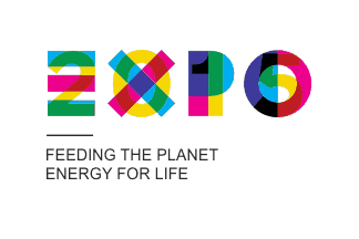
image by Zoltan Horvath, 07 January 2016
3. Third version: horizontal white flag with plain logo and below the
inscription MILANO in black capitals and the slogan FEEDING THE PLANET in black
capitals, and below that also another slogan ENERGY FOR LIFE (in black capitals
as well), as seen
here.
Source:
http://dfaeurope.eu/eidd-dfa-europe-general-assembly/
Esteban Rivera, 21 January 2016
A horizontal white flag with the plain logo, with under the logo a grey
separator line spanning the width of the E of the logo, and below that in a
black sans font the text "MILAN" long enough to reach the X of the logo, and
below that in the same font but at 3/4th the font size of the line above it the
two lines "FEEDING THE PLANET" and "ENERGY FOR LIFE", the charges together
centred vertically on the flag, though horizontally they are each left aligned
to a line quite close to the hoist (a distance of approximately one em for the
font of the "MILANO" line).
(Part of the first motto is an educated guess, for being hidden from view.)
Here too, nothing is visible of the other side of the flag, but neither is
anything in the background visible through the flag, thus the flag may simply be
too dense to see.
Either the flag is shorter than the previous one or it has been designed for use
on a staff, or both.
Peter Hans van den Muijzenberg, 21 January 2016
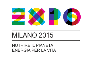
image by Zoltan Horvath, 07 January 2016
At
http://www.imsb.it/2014/05/03/expo-2015-imsb-e-le-marching-band-italiane-ad-expo-gate/
is a different version again (click third photograph, or second), showing flag
bearers marching with several specimen of the flag: This one is at most 2:3 and
is apparently intended for a staff. It has the long separator line and the text
"MILANO 2015" of the second version, then below that another line of the same
length. And below that the two lines of the third version appear, all with the
same alignment again and the same fonts. This time the borrow two lines are in
Italian, however: "NUTRIRE IL PIANETA", "ENERGIA PER LA VITA".
In this image is also an upright flag, maybe held upright not to hit the shop
next to it. That one shows the reverse, which as it turns out is not blank [that's
how I know it's the same flag, of course]. The reverse of the flag shows the
design in reverse.
I don't know whether this version exists with English text, or the other one
with Italian text. Again, we may need the events style manual. Does anyone have
an in for this?
Peter Hans van den Muijzenberg, 21 January 2016
Also of interest was a meeting prior to the Expo, held on October 10, 2012,
named "Expo 2015 2nd International Participants Meeting, Flag ceremony". This
was a flag parade in which the Expo 2015 flag is seen, as well as that of the
BIE, the
participating
countries (so far up to that date) and
CERN.
Source:
https://www.youtube.com/watch?v=5kPw8Ab27iM&feature=youtu.be.
A particular rendition of the U.S. flag was seen at the
U.S. pavillion, where they feature the "American
Food 2.0". It is a U.S. flag with nine horizontal stripes (instead of 13, five
being red and four being white, starting with red on top) and also
instead of the stars, it features a white fork, a white dish and a
white knife (in resemblance of the main utensils for eating a meal).
Esteban Rivera, 21 January 2016
They don't just march the flags, they also do flag-waving and eventually
flag-throwing. And this in full choreography, with multiple flags passing
through the air at the same time.
But check the flag-waver who is literally juggling flags: Holding at least three
flag, of which during each figure always at least one is in the air!
The flags of the separate countries, and some organisations involved, probably
all had to be the same size to make all this possible. In any case, a flag of
Nepal can be seen, seemingly correctly shaped, except for the cloth continuing
white to form the same rectangle as the others. (Enters the picture after 54
seconds.)
I'm not sure of the exact ratio. Vendels ... Is there really no better word for
throwing flags in English than "colours", with the implied relation to a
military unit? Well: "Vendels" are usually square, but all the horizontal and
vertical stripes in motion are making it difficult to be sure, here.
Well, watching again, I think they are indeed square. Which means that at least
the BIE flag has a square form in its vendel so prominently shown in the
foreground. And the same holds for the EXPO2015 flag passing by the camera at 1
minute, though mostly obscured by Oman.
And we know that it's actually a flag (of sorts), as they are "raising" it in this picture. This also shows that the white space below it with the black text "AMERICAN FOOD 2.0" is indeed part of the cloth. (Though there's white below the flag, this isn't another line below the ones already counted, as from their logo separate from the flag and without the text we can see that it doesn't continue below the fifth red stripe.)
Which would also be the case for the USA pavilion site mentioned above, it
would seem. (On the assumption that the USA did indeed pay their past dues and
are now let back in to the expos.)
Peter Hans van den Muijzenberg, 21 January 2016
I agree that Vendels could be more appropriate rather than square versions of
each flag seen in the video during the parade. After looking to other similar
events, my conclussion as well as yours, is that all flags in this show are
square, most likely due to its easier way to handle when juggling with them.
Unfortunately I searched everywhere and there's no corporate identity manual for
Expo 2015. Nor do I know if there are other versions in other languages (aside
from the English one that we've seen). The only thing I found was that indeed
this
flag which you reported and it is labeled as the only official flag,
incorporates an official mascot,
Foody which is a first (none of the previous Expos had mascots, at least to
my knowledge). And also in this official flag (top right), one can see the name
of the official organization in charge of the Expo, called "Expo
2015 S.p.A. (Società per Azioni, a public limited company) (official website:
What do you think about the "American Food 2.0"? Do you consider it to be a
proper flag?
Esteban Rivera, 22 January 2016
Well, it's cloth of some kind and it was raised. But, no: It's a depiction of
a logo with text underneath, and it probably would have been painted on if the
image hadn't been derived from the S&S. It's related to a flag, but I don't
think it's a flag in itself. Flags aren't usually a foot thick and shining light
at night.
Peter Hans van den Muijzenberg, 22 January 2016
.jpg)