
Last modified: 2014-06-29 by klaus-michael schneider
Keywords: marco lino | cardoso (marcolino) | proposal | portuguese confederation | star: 5 points (yellow) | stars: 6 | stars: ring | coat of arms: escutcheons | coat of arms: per mantel |
Links: FOTW homepage |
search |
disclaimer and copyright |
write us |
mirrors
A draft for a “Constitution of the Portuguese Confederation” was written by a Marcolino Cardoso in 1969.05, as a thesis to be presented at the Opposition Congress to be held that year in Aveiro (note this happends still during the 1926-1974 dictatorship in Portugal); however he was later forbidden to do so (according to the author, as a form of prosecution onto himself, even among oppositionist circles).
It was finnally published in 1974.05, in a book intitled A Confederação Portuguesa (Renascença Editora: Lisboa, 1974), under the psudonym “Marco Lino” [lno74] — and to which volume were added in the last moment many other texts suddenly become publishable after the revolution of 1974.04.25.
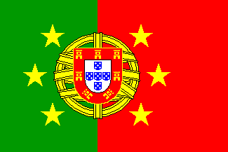
Apart from illustrating the author’s view of the society at large and of the Portuguese Empire in particular, this work has several pages displaying flags for the proposed confederation and its constituent units, namely on the cover (in color), on six black and white double pages, and on one color double page. There is not, however, any reference to these flags in the texts of the book.
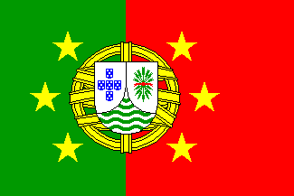
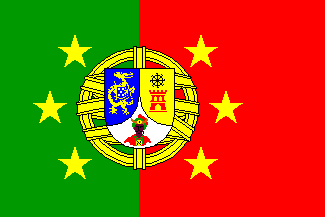
The general scheme is the current portuguese national flag, a green-red bicolor (but with the green in the hoist 3/7ths, instead of the usual 2/5ths — something that may be an error out of distraction), charged with six yellow stars (symbolizing the six units of the proposed confederation) around the armillary sphere, this charged with a shield filled with the symbols of each unit.
On these one may criticize a certain lack of imagination (contrasting with the delirious phantasy of other proposals included in this book…) and also of consequence, since the 1935 colonial arms are used, unless for an arbitrary replacement of some of the fields where necessary — what may suppose some lack of heraldic-vexillological sensibility, contrasting with the author’s obvious enthusiasm.
Some citations may better show the thought of Marcolino Cardoso: «The peoples of Portugal — mainland, islands and overseas» make up «a clearly distinct nationality». «This unity »…« is still necessary for the protection» of the colonies, «not to give them away to the hazards of an immature emancipation and to the assaults of the unavoidable foreign covet.»
He further refers as «despeakable criminals» Hitler, Mussolini, Estaline, Xang-Kai-Xeque, Sigman Rhee, Tchombé, Salazar, Batista, Nero, Calígula, Átila, Gengis-Khan, Cortes, Béria, Pavelitch, Himmler, Lourenço, Catela, Silva Pais, Duvallier, Porfírio Díaz, Stroessner, Trujillo and Castillo Armas», and dedicates his work «to the heroic freedom fighters» Marshall Tito, Marcos of Greece, Fidel Castro, Ernesto “Che” Guevara, Mao Tsé Tung, Salvador Allende, Patrício Lumumba, Amílcar Cabral, General Bayo, Palma Inácio, Varela Gomes, Manuel Serra, Moura Pimenta and Humberto Delgado (all names sic)…
António Martins, 09 May 1999
Supposedly the current national flag added with
the six confederation stars, it is however depicted with the shield lined
in gold (instead of the usual silver), and its border charged with towers,
instead of castles.
These differences were certainly made out of distraction, but I chose to
keep them in the image — the difference between red towers in the
inner page and golden in the cover image I decided however to solve by
keeping the most correct form…
António Martins, 09 May 1999
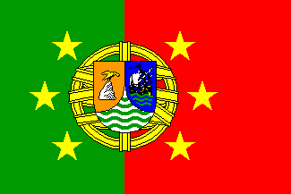
Acording to this project of Portuguese Confederation, its Atlantic
Islands Federation was in turn made up of the North Atlantic Island
Republic / República Insular do Atlântico Norte (island groups of
Madeira and Azores) and
Central Atlantic Island Republic / República Insular do Atlântico
Central (island groups of Cape Verde and
San Tomé and Príncipe. The arms used the
1935 scheme, keeping the
Cape Verde ship in the sinister field (that
might also stand for San Tomé), although, maybe out distraction, with the
background changed to blue and the sea waves to blue and green (!).
The dexter field is changed to orange, a goshhawk standing on a rock,
all proper — the goshwak is the usual heraldry symbol for the
Azores, here taken to symbolize also
Madeira.
António Martins, 09 May 1999
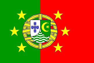
Keeping the general layout of the 1935 scheme,
this project replaces the “politically incorrect” (at the time one would say
rather “reactionary”…) sceptre of King Afonso V (topped by a negress head)
by an islamic crescent and star, golden on green.
António Martins, 09 May 1999
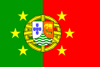
It keeps the general layout of the 1935 scheme,
but the sinister field is changed from purple to orange (a “redder” shade than
the Atlantic above) — which may be a typographical error.
António Martins, 09 May 1999
It keeps the general layout of the 1935 scheme
with no change whatsoever, something after all unique in this set of proposals.
António Martins, 09 May 1999
Acording to this project of Portuguese Confederation, its Federation of the East was in turn comprised of the three Portuguese Republics of Macao, Timor and India. Over the shield “tierced per mantel”, typical of the 1935 arms, the three avaliable fields were filled with symbols for each territory:
Anything below this line was not added by the editor of this page.