
Last modified: 2025-11-01 by  klaus-michael schneider
Keywords: santa casa da misericordia de lisboa | miza | escutcheons | anmp | maps | movimento de apoio a problematica da sida | e | expo ’98 | julio | tourism | family-friendly |
Links: FOTW homepage |
search |
disclaimer and copyright |
write us |
mirrors
![[Portugal national flag]](../images/p/pt.gif) 2:3, image by Vítor Luís and António Martins-Tuválkin, 23 Sep 2004
2:3, image by Vítor Luís and António Martins-Tuválkin, 23 Sep 2004
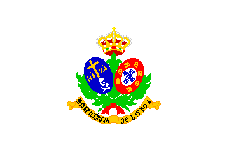 image by Jorge Candeias, 7 Oct 1997
The Lisbon Holy House of Mercy (Santa Casa da Misericordia de Lisboa), created in the last century with the main objective to provide help to the poor, as a charity organization, with strong connections with the Church. It’s not the only Holy House of Mercy that exists in Portugal, there are quite a few more, but it’s by far the richest and the better known. I don’t really know much of it’s history and legal status, but I do know that it has had the responsability of managing the profits of
most of the legal gambling (lotteries, lottos a.s.o.). It has a very complex arms and a flag, the arms on a white background. The arms consists of a golden scroll reading "MISERICÓRDIA / DE LISBOA" in black capitals, a few green branches that hold two tilted and symmetrical to each other oval sields, one being an oval depiction of the Portuguese traditional arms, and the other one containing a white skull and crossbones below a golden cross and the letters "MIZA". The whole thing is topped by a 5-stemmed crown.
Jorge Candeias, 3 Oct 1997
 image by Jorge Candeias, 15 Oct 1997
I have mentioned to the list several times before Expo’98, an international exhibition that will take place in Lisbon next year.
It will be a thematic event under the theme «The oceans — a heritage for the future». More than 100 countries and organizations will be there, so it will be a major event.
Like other similar events, Expo’98 has a flag of its own. It is, of course, just a logo-on-bedsheet flag, but, since the logo is in my humble opinion a particularly beautiful one, I like the flag quite a lot. The flag is white, with the logo in its superior 2/3 and "EXPO’98" below in dark blue. Above and towards the right, appears the word "LISBOA" in smaller font, also in dark blue.
The logo is basically a blue ellipse raised to the right with white wavy lines that compose the character "E", representing the oceans and their waves, with the "E" for the expo itself. Near the leftmost zone of the “oceanic” ellipse, a yellow semicircle represents the rising sun.
Jorge Candeias, 15 Oct 1997
 image by Jorge Candeias, 26 Mar 1998
MAPS is a Portuguese AIDS-related NGO (non-governmental organization), and the sigla means "Movimento de Apoio à Problemática da SIDA", that is "Movement for Support of AIDS Problematics", or something of the sort.
It’s one of the most typical of the most typical LOBs: white with logo. But it’s even worse than ordinary LOBs not only because the logo ain’t that good in itself (a couple of scrawls based on the AIDS campaign ribbons in weird colours — orange and a sort of greenish brown or grey —, the sigla in black and the full name also in black) but because it’s disposed strangely, slightly curving upwards to the right (note: to the right, not to the fly — I guess this thing is not mirrored in the reverse, though I can’t say ’cause only the obverse was visible), making the whole look quite unstable and unbalanced.
Source: I spotted this flag on occasion of a congress of the NGO in my town not long ago.
Jorge Candeias, 26 Mar 1998
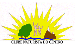 image by Francisco Santos, 27 May 2003
Clube Naturista do Centro (Naturist Club of the Centre [of Portugal]) «follows naturism by the practice of communal nudity, to improve a more healthful and harmonious life, with respect for each other and for Nature». Their flag is self-explanatory.
Francisco Santos, 27 May 2003
![[Júlio de Matos hospital]](../images/p/pt_hjm.gif) image by António Martins-Tuválkin, 17 June 2005
image by António Martins-Tuválkin, 17 June 2005
This is flag of Júlio de Matos Hospital, no doubts about it, as it is spelled across the bottom of this plain dark blue flag in bold golden letters, just under the shield with Portugal ancient. Júlio de Matos, born 1856, was a reknown psychiatrist, and his name was given to this large Psychiatric Hospital, recently (ca.2000) transformed into a Health Care Centre, with most of the original buildings scattered around the hospital park changed from psychiatry to other medical roles. Due to this, the hospital grounds receive many more users than before, and that may be the cause for this flag, which I never had seen before (I lived quite near this hospital in 1973-1996). The flag itself, hoisted daily just inside the main gate, looks new, and the manufacturer's label is visible.
The design is strange because of two things:
1. The use of the national CoA (a ancient variant of it, actually) for a Hospital, even if a State one, as for any other entity (incl. municipalities) is legally discouraged since the thirties, when it was popular; nowadays it is not popular and it is hard to imagine that a flag such as this is a modern (post-1960) creation.
2. One expect that other hospitals would have identical flags, variying only the writing. And yet I never seen such a hospital flag, neither had any body else, neither something like it shows up vexillological literature.
António Martins-Tuválkin, 17 June 2005
![[Central Psychological hospital]](../images/p/pt_chpl.gif) image by António Martins-Tuválkin, 23 Apr 2009
image by António Martins-Tuválkin, 23 Apr 2009
Strange as it was, it is not used anymore - a couple of months ago, I noticed it was replaced by a white flag with the hospital logo on it. This shows a dark blue pattern of squares shaping the letters "CHPL" above the black lettering "Centro Hospitalar Psiquiátrico de Lisboa", set in 4 lines of sans-serif capitals.
António Martins-Tuválkin, 23 Apr 2009
![[Coimbra University hospitals]](../images/p/pt_huc.gif) image by António Martins-Tuválkin, 23 Oct 2008
image by António Martins-Tuválkin, 23 Oct 2008
According to a report sent to Lusovex on 19 June 2005 by Luís Miguel Silva, the Coimbra University Hospitals (Hospitais da Universidade de Coimbra) fly a white flag with its logo in black and white.
António Martins-Tuválkin, 23 Oct 2008
![[Portuguese Plus-Minus-Flag]](../images/p/pt!pm.gif) image by António Martins-Tuválkin, 15 Jan 2024
image by António Martins-Tuválkin, 15 Jan 2024
Plus-Minus Portuguese: maismenos; )± is a public critique intervention project by Miguel Januário (* 1981), which questions the social implications of the current economic and social models as well as the political status quo. Starting as a finalist school Project at the Faculty of Arts in the University of Porto, the project evolved to challenge the responsibilities and the role of the artist and designer within those models. His conceptual program emerges synthesized in the form of verbal and visual equations on simplicity and opposites: more/less (in Portuguese "mais/menos"), positive/negative, black/white.
One of maismenos ± installations, bearing the writing "± / RESPECT / THE / FLAW" in black letters - "±" and this font are the project´s "trademark", includes a flag vertically divided green-red with a yellow "±" in the middle. The flag is shown, "flying" in a video captioned: "Proposal to update the Portuguese flag, together with the increase of the length of the national anthem to two times, reducing the speed to half, institutionalizing in video with a loop editing, first backwards and then forwards. This intends in keeping with the reality of our country." It also "appears" on a photo of a street demonstration.
Ivan Sache, 22 Sep 2012
Miguel Januário, the artist behind the the marque Mais Menos uses flags in his installations / interventions  see f.i., what he brought to the on 12 March 2011 Lisbon demonstration: À Portuguesa´ - Proposta de nova bandeira
Sources: this photo and this photo
António Martins-Tuválkin, 15 Jan 2024
![[Portuguese Plus-Minus BoA]](../images/p/pt!pm).gif) image by António Martins-Tuválkin, 15 Jan 2024
image by António Martins-Tuválkin, 15 Jan 2024
This was not the first time that Miguel Januário, the artist behind the the marque Mais Menos, ± used flags in his installations / interventions. Here is another one, again an actual flag (well, sorta) with its elements replaced with plus-minus signs: This time it is the Portuguese national
Banner of Arms of 1185-1248, briefly shown in a spoof video about the History of Portugal, held by a mediaeval knight in battle gear (probably filmed in Guimarães Castle). The flag is square, and has on its white background five black "±"s set per cross, matching the original.
Source: this video, timestamp 00:29
António Martins-Tuválkin, 15 Jan 2024
![[collage AO-BR-CN-PT]](../images/p/pt!abcp.gif) image by António Martins-Tuválkin, 14 Jan 2024
image by António Martins-Tuválkin, 14 Jan 2024
The attached image is a mashup of the national flags of China, Angola, Brazil and Portugal:
divided vertically unequally in red and black, with the 1+4 stars of the People´s Republic of China emblem at the upper hoist and, centred on the partition, the cogwheel and machete emblem of Angola enclosing the Portuguese national arms, which in turn bear the Brazilian flag motto band. At the lower fly, a plus-minus sign as the artist´s signature. All yellow elements rendered as golden; elements resized to match: all smaller than on their original flags except for the Angolan arms. Actual cloth flag (144cm ×101cm) was made.
Source: this photo
António Martins-Tuválkin, 14 Jan 2024
![[Lisbon Zoo red flag]](../images/p/pt_zoolx.gif) 2:3 image by António Martins-Tuválkin, 24 Sep 2010 |
![[Lisbon Zoo white flag]](../images/p/pt_zoolz.gif) 2:3 image by António Martins-Tuválkin, 25 Sep 2010 |
The Lisbon Zoological Garden flies at its main entrance, and possibly in other locations, its flag: red ratio 2:3 with logo in white centred on it (personal observation). Wikipedia presents a previously used version was white with red logo.
The logo is dark red and black on white background in all other uses; it shows an elephant outline in dark red above centred text reading "Lisboa Jardim Zoológico Portugal" in for lines, the middle ones set in black serifed roman monumental capitals and the top and bottom ones in dark red formal modern cursive hand. This logo was adopted around the mid 1990ies. The Lisbon Zoo (official full name Jardim Zoollógico e de Aclimação de Lisboa) opened in 1884.
For further information click here.
António Martins-Tuválkin, 24/25 Sep 2010
![[Portugal Tourism #1]](../images/p/pt$tour.gif) 2:3 image by Zachary Harden, 8 Nov 2016 |
![[Portugal Tourism #2]](../images/p/pt$tour!.gif) 2:3 image by Zachary Harden, 8 Nov 2016 |
Turismo de Portugal (lit.: Tourism of Portugal) is a governmental entity, that mainly promotes the brand of Portugal abroad as a tourism destination; see official webiste [ https://www.visitportugal.com/ ]. Its logo changed recently in typographic details; the former logo was shown in their flag, which might change or have changed already, but I failed to see it "in the wild"" yet.
António Martins-Tuválkin,
![[Family-friendly Municipalities in Portugal Award Flag 2013]](../images/p/pt-afr3.gif) 2:3 image by António Martins-Tuválkin, 22 Nov 2016 |
![[Family-friendly Municipalities in Portugal Award Flag 2015]](../images/p/pt_afr5p.gif) 2:3 image by António Martins-Tuválkin, 22 Nov 2016 |
The award Autarquia mais familiarmente responsável (styled "AFR - Autarquia + Familiarmente Responsável"®) is given yearly to Portuguese municipalities, which fulfil preset conditions by an organ of the Portuguese Association of Large Families (Associação Portuguesa de FamÃÂlias Numerosas), the Observatory of Family-Responsible Local Governments (Observatório de Autarquias Familiarmente Responsáveis). This is a private association and this observatory's funding comes from Millennium BCP - Banco Comercial Português.
The award entitles using signal flags that the awarded municipal goverment may hoist in its facilities, and its design shows the association's logo, with a stylized countour of a family of five, with three children holding hands, the year of the award, its logo , its title abbreviated to "AUTARQUIA + FAMILIARMENTE RESPONSÁVEL", and, for flags being awarded at least 3 years in a row to a given municipality, two large (very stylized) palm fronds (see right image above) - all in white on light green. There may have existed trivially different flag designs for each year. The 2009 flags seem to be the same shade of light green as those in use in later years; the oddly coloured 2010 flag is unique - either one sun-damaged flag or a printing error in that particular copy, but not a design choice for that year.
Source: here
António Martins-Tuválkin and Peter Hans van den Muijzenberg, 22/23/25 Nov 2016
![[Port. Healthy Municipalities Network flag]](../images/p/pt_rpms.gif) image by António Martins-Tuválkin, 6 Apr 2017
image by António Martins-Tuválkin, 6 Apr 2017
Portuguese Healthy Municipalities Network (Rede Portuguesa de Municípios Saudáveis), a private intermunicipal entity created in 1999, awards localised award flags to the municipalities that comprise its membership. (I´ll refrain to share my thoughts about this kind of entities — I´ll just say that Mr. Jeroen Dijsselbloem should rather address this particular kind of financial dissipation by goverment entities in selected countries, instead of slackjawedly relying in tired and inaccurate stereotypes…)
The award flags given out by this organisation lack, unlike most other such flags, an indication of the year or other time frame the award is good for (maybe healthy once, healthy for ever?).
The archevexillum is a white flag with the name of the municipality in bold face across the top 1/4th of the flag area (replaced by
"(MUNICÍPIO)" in the attached image the words "MUNICÍPIO SAUDÁVEL" (healthy municipality) on a line below, in regular weight, and
the logo or the organisation centered on the lower part of the flag, also on white background.
The logo shows a stylised leaf pointing to the upper hoist, made of a yellowish green shape for the left half and for the right of shapes in blue, pink/purple, and orange, from the base to the top in decreasing sizes; these three shapes of the right half of the leaf are dotted with squarish white shapes/holes, in addition to the white/background areas visible through the deep lobe gaps all the four shapes share. I guess that this design aims to represent not only a leaf but also a sectorized map.
To the right of the logo, the name of this organisation styled as "Rede Portuguesa de Municípios Saudáveis" (because good logo design means you have to cripple grammar and syntax to fit silly notions of legebility), set in four lines, the top two in regular weight and the lower two in bold face; along the bottom of the text block, in much smaller type, the statement "Associação Parceira da OMS" (meaning "O.M.S. partner organisation"). All text of the flag is set in Calibri, and everything except the mention of "OMS" set in capitals.
António Martins-Tuválkin, 6 Apr 2017
![[Grupo Coral Infantil e Juvenil de Cabreiros flag]](../images/p/pt_gcijc.gif) image by António Martins-Tuválkin, 27 Sep 2024
image by António Martins-Tuválkin, 27 Sep 2024
Grupo Coral Infantil e Juvenil de Cabreiros, active in Braga Municipality is a a k-12 choir and marching band.
Back in 2017 I found several photos of this flag in use and decided to give it a go: The flag itself is unremarkable, but its intense use, with one of the kids being a standard-bearer, is interesting. I just found out that the webblog of this entity has been removed by Google (on request from the owner, one presumes), although some of its photos can still be found online.
The flag itself is vertically divided in two halves, (golden) yellow and white, in what could be a nod to the Vatican flag, but it is Braga — everything knods to the Catholic church there. On this background the logo of this entity, showing an angel and a choral book, over all and its full name in an ornamental script typeface: "Grupo Coral Infantil e Juvenil" centred along the top and "Cabreiros - Braga" centred along the bottom. The angel has nimbus in white, clad in salmon, shod in red, with flesh-coloured scarf and teal wings, exibiting honey-colored hair and fair complexion; the book is shown open with red binding and white pages, whence wafts a wavy music score.
Sources: here, here and here
António Martins-Tuválkin, 27 Sep 2024
![[Sociedade Portuguesa de Naturalogia flag]](../images/p/pt_spnat.gif) image by António Martins-Tuválkin, 13 Nov 2023
image by António Martins-Tuválkin, 13 Nov 2023
The society was created in the early 20th century and has its headquarters in Lisbon. It currently engages mostly in vegetarian and vegan food and lifestyle, and several types of alternative “medicine†and spirituality, and also, though less so, on camping, trekking and other such outdoor activities.
Its flag is plain green with its logo centred on it in large size. The logo seems to be as old as the organisation. It is a vertically oblong lozenge, thickly edged in black, showing a stylised lansdcape with a ground hill in foreground, with a white tent and an orange tree before it, beyond/behind which the sea is shown as light blue with four horizontal white stripes, while the top half of the lozenge, on the background, is filled with an orange sunset on a yellow sky, the half sun disc centred and partly obscured by the hilltop and emitting nine wide beams; at the bottom apex of the lozenge, the letters "SPN", in yellow.
António Martins-Tuválkin, 13 Nov 2023
![[Club Recreativo e Educativo Valesinense flag]](../images/p/pt_crev.gif) 2:3, image by António Martins-Tuválkin, 16 July 2025
2:3, image by António Martins-Tuválkin, 16 July 2025
The flag of the recreation and education club is blue with a tangent yellow rhombus bearing a logo,
see here and here
António Martins-Tuválkin, 16 July 2025
back to Portugal main page click here.