
Last modified: 2021-08-25 by  christopher oehler
Keywords: house flag | shipping: sweden |
Links: FOTW homepage |
search |
disclaimer and copyright |
write us |
mirrors
See also:
![[Swedish Orient Line]](../images/s/se~sol.gif) image by Jorge Candeias, 21
March 1999
image by Jorge Candeias, 21
March 1999
Swedish Orient Line (Sweden) - White with a blue disc centered, charged
with the three crowns of Sweden. I've got a question on this. These three crowns have the dignity of a state symbol in
Sweden. Although, some other houseflags "borrow" colours and/or flag
designs from their home-countries, none of them has this strong connection to
the state symbols. Doesn't it arise some discussion in Sweden to see the three
crowns on a private flag?
Jorge Candeias, 21 March 1999
Swedish Orient Line (SOL) was founded in 1911 and belonged to Ĺngfartygs AB Tirfing, later the Broström group. During the years 1984-1991 it belonged to the Transatlantic group. SOL is situated in Gothenburg. It has shipping lines mainly between the Baltic Sea and the Mediterranean.
According to information on the homepage, at http://www.sollines.se/, many of the
services are now operated in the name SolNiver Lines, a joint venture with
Scan Orient Shipping Co. Ltd. which is a subsidiary of the Greek shipping
company Niver Lines. SOL holds 60 % of the shares in SolNiver Lines. However,
I did not find any information about any house flag for SolNiver Lines.
Elias Granqvist, 17 March 2001
Formed as Svenska Levant Linien, or Sverige-Levanten A/B (sources vary)
becoming Swedish Orient Line in 1927 (company website) changing from this in
1995 to B&N Svenska Orient Linien A/B until 1997 when Swedish Orient Line
A/B was adopted (Lloyds). According to Brown 1926 [9] they
used a Broström flag of 4 blue and 3 red horizontal bands with a white "O"
wholly overall the 3rd to 5th bands whereas post-World War 2 sources show it using the Broström flag proper with the combined white letters "AB".
Subsequently they appear to have inherited the flag of A/B Svenska Amerika
Linien which had also become part of the Broström group with the flag
appearing on their website but with the blue of the circle being in line with
the national colours.
Neale Rosanoski, 5 August 2003
![[Svenska Rederi A/B Öresund]](../images/s/se~s0568.gif) image by Phil
Nelson
image by Phil
Nelson
Source: Colin Stewart and John B. Styring: Flags, Funnels and Hull Colours, 1963
[6].
This is a case of déjà vu. Three years or so ago someone had seen the P&O flag in Atlanta, and wondered what it was.
I mentioned having seen it in the Sound (the water between Copenhagen and Malmö). This was what I had seen.
Ole Andersen, 22 September 2000
This flag is shown by the US Navy 1961 [8] as also for A/S D/S Öresund, the
Danish company based Copenhagen with Talbot-Booth 1942 also confirming
use by the latter. They managed some of each others vessels at times and
appear to be associates with the colours possibly symbolizing Sweden and
Denmark. The latter was absorbed into Scandlines
A/S in 1997 by which time Svenska Rederi A/B Öresund were managers only
for a D/S A/S Öresund vessel. It is of course not the same as the P&O
flag which has the same colours but in a different order.
Neale Rosanoski, 5 August 2003
![[Svenska Sockerfabriks]](../images/s/se~ssa.gif) image by Jarig Bakker, 17
August 2005
image by Jarig Bakker, 17
August 2005
Source: http://kommandobryggan.se/last/last.htm.htm
ship S/S Lida, built 1920, Upphuggen 1964 i England
and lived happily ever after - white flag, red disk with a narrow white
concentric circle surrounding white "SSA".
Jarig Bakker, 17 August 2005
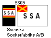
Sources vary with the thickness of the outer ring and
Brown 1982 [3] shows it as black instead of red. There appears to
have been another flag, apparently earlier, based on a cap badge in
the Collectors Corner site being white with a red canton bearing a
gold saltire, and on the field the black letters "SSA". The "Lida" was owned by the company from
1935-1938 and the photo on the kommandobryggan site is not clear
enough to make out the name so I would hesitate to associate it with
its time as "Lida", especially as the funnel markings do not
correspond.
Neale Rosanoski, 29 August 2006
image contributed by Neale Rosanoski, 29 August 2006
pre-1969 flag
![[Sveriges Oljekonsumenters Riksförbund]](../images/s/se~s0867.gif) image by Phil Nelson
image by Phil Nelson
Source: Colin Stewart and John B. Styring: Flags, Funnels and Hull Colours,
1963 [6].
OK is the co-op oil company. In Sweden, their gas stations have merged with
Kuwait Petroleum's.
Ole Andersen, 23 September 2000
Nowadays, these gas stations have the name "OK Q8", the logo
(also used on flags) being two half circles, one blue and one red, side by
side with their open ends away from each other.
Elias Granqvist, 23 September 2000
post-1969 flag
![[Sveriges Oljekonsumenters Riksförbund]](../images/s/se~oljk4.gif) image by Jarig Bakker
image by Jarig Bakker
Sveriges Oljekonsumenters Riksförbund was formed
1945 changing name to Oljekonsumenternas Förbund in 1963 and then later
apparently to Oljeksumenterna-Ok. In 1969 the livery was changed to avoid
confusion with that of ESSO with the flag becoming white bearing the large red
letters "OK" angled slightly per bend sinister. Shipping operations
appear to have ceased in the latter 1980s.
Neale Rosanoski, 5 August 2003