
Last modified: 2023-02-03 by bruce berry
Keywords: south africa | pretoria | tshwane |
Links: FOTW homepage |
search |
disclaimer and copyright |
write us |
mirrors
 image by Martin Grieve, 01 Feb 2023
See also:
image by Martin Grieve, 01 Feb 2023
See also:
In June 2011, the Tshwane Metropolitan Municipality and the Metsweding District Municipality, which includes Nokeng tsa Taemane (Cullinan) and Kungwini (Bronkhorstspruit), merged to form the City of Tshwane. As a result of these changes, the Mayoral Committee embarked on a process to create a new brand identity for the city which involved a student competition to design a new logo. Accordingly, invitations were sent to various tertiary institutions in the city requesting students to submit proposals for a new logo. A total of 61 proposals were received with 11 designs and 5 slogans being short-listed. The logo was designed by Moshe Ngoasheng and Bridget Phaahla, both students at the Tshwane University of Technology, who each won R20 000. Jessica Adendorff, a student from Open Window, won R10 000 for having her slogan chosen by the City.
gt-th.png) image sent by
Bruce Berry, 03 Feb 2023
image sent by
Bruce Berry, 03 Feb 2023
The City's new corporate identity was formally launched by the Mayor during the State of the City address on 27 March 2012 features the following symbols:
1) The Union Buildings
The Union Buildings are located on the highest point in the City and are the official seat of the Government of the Republic of South Africa and also house the Office of the President. This iconic landmark has come to be globally recognised as a symbol of Tshwane, democracy and the people of South Africa. Synonymous with the structure are its towers and colonnades.
The Union Buildings were designed by Sir Herbert Baker in the monumental style and are 285m long. They have a semi-circular shape, with two wings at the sides, serving to represent the union of a formerly divided people, construction having begun in November 1910 shortly after the formation of the Union of South Africa. The clock chimes are identical to those of Big Ben in London. The east and west wings, as well as the twin-domes towers, represent the two languages, English and Afrikaans, and the inner court was designed and built to symbolise the Union of South Africa. These buildings are considered by many to be the architect's greatest achievement and a South African architectural masterpiece.
The Union Buildings are the site of presidential inaugrations. The official offices of the President of South are on the left, and the South African national flag is flown on the left-hand side when the president is in office.2) The Colonnades
The eight visible pillars of the colonnade represent the City of Tshwane's value system, the pillars on which the City is built, namely Leadership, Excellence, Innovation, Inspiration, Community Orientation, Business Orientation, Accountability and Trust.
3) The Tower
The Tower represents the authority of Tshwane as a leading city of commerce in South Africa, with Mercury, the mythical Roman messenger and god trade, holding up the world. The dynamic shape is an expression of movement and growth that starts horizontally and works its way up vertically to the sun.
The dynamic shape is an expression of movement and growth that starts horizontally and works its way vertically. The shape features four steps representing the City of Tshwane's core brand values of Leadership. Inspiration, Innovation and Excellence. The four steps rise to meet the sun which is synonymous with Africa and gives warmth, light and growth. It is depicted as rising and expanding.
The font used in the logo was named after the mountain Nyala, an African antelope native to the Highlands of Ethiopia. This supports the link between Tshwane and the rest of the continent.
Since colour provides a medium for brand expression, the colours of the new logo were selected to express the City's strategic objectives. Black stands for regeneration and the process of development and transformation. Yellow stands for wealth and the drive to ensure sound governance, financial stability, economic growth, development and job creation. Green stands for contentment which is achieved through the provision of basic services and the fulfillment of democracy and Batho Pele (literally "people first") principles (which are the guidelines for Public Servants in South Africa)
The slogan, "Igniting Excellence", underlines the City's vision to become the African Capital City of Excellence.
The flag of the city features the new logo
being placed in the centre of a white field.
Bruce Berry, 03 Feb 2023
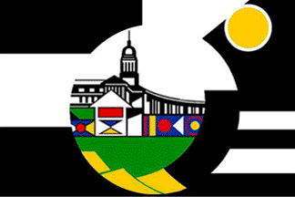 image by
Martin Grieve, 18 June 2004
image by
Martin Grieve, 18 June 2004
On 05 April 2002 the Tshwane Metropolitan Council adopted a new logo.
The Tshwane Metropolitan Council incorporates the former municipalities of Pretoria,
Centurion, Mamelodi, Akasia, Atteridgeville and Hammanskraal
and was formed following the re-organisation of local government in
South Africa in December 2000. The flags used by these former municipalities are now no longer in use. The new logo forms the basis
of a municipal flag. The logo has the inscription "City of Tshwane - we are the same" beneath but this has been omitted from the flag.
The symbolism of the new logo and flag as provided by the Metro Council Marketing Office is as follows:
The Union Buildings, shown in the centre of the logo, are an important landmark both in the city and South Africa. They were designed by Sir
Herbert Baker and were completed in 1912 and house the Office of the
President. They are a political symbol that gives expression to the capital status of the City of Tshwane.
The structure below the Union Buildings symbolises the vast array of architectural infrastructure throughout the length and breadth of the
metropolitan area. It also symbolises a commitment to further developing this infrastructure. The geometrical figure superimposed on this
structure celebrates the artistic expression of the people of Tshwane in their endeavours. It is also provides recognition and acknowledgement
of the important role that women play in society.
In isiNdebele customary tradition, as in many other African societies, the function of decoration and architecture is assigned solely to women.
The colours used in the mural covering the bottom part of the Union
Buildings are the national colours as captured in the country's flag.
The mountain range at the foot of the Union Buildings and the structure below symbolise coherency and, together with the "broken circle" that
encompasses these structures, symbolises the constant endeavour to
manage cultural diversity.
The "broken circle" also symbolises Tshwane's position among the cities of the world. It denotes the influence of the outside world on the city
as well as Tshwane's ability to influence the outside world in developing the modern and dynamic modern city.
The overall symbolism of the logo and flag is thus the management of cultural diversity, provision and maintenance of infrastructure and
delivery of services across the entire municipal area of jurisdiction.
The yellow circle in the top right denotes, in an African context, the infiniteness of life, the ability of life to find expression in various
forms - thus there is no end but a resumption of life in another form. Furthermore this circle denotes the sun, a primary life-giving
phenomenon, a characteristic that testifies to the omnipresence of
hospitality displayed by the city.
The explanation of colours found in the logo and flag is premised on the explanation given by the various indigenous nationalities residing
within the City of Tshwane, namely:
o Black means total protection from all harm and evil;
o White means a blessing from the creator and good luck in ones endeavours;
o Yellow means that everyone has to be humane (ubuntu) and appreciative of the fact that in life there are various stakeholders,
thus communication and consultation are very important;
o Green denotes reward after the triumph over hardship;
o Red signifies a challenge, a situation to be overcome; and
o Blue symbolises a force that sustains and ensures that life thrives.
These new symbols were not registered with the South African Bureau of Heraldry.
Bruce Berry, 18 June 2004